Project Reveal: Pillsbury Castle Moody and Relaxing Guest Bedroom
Friends, I’m so eager to share a very special project with you today. Unlike most of my reveals, this one is part of a larger scale project involving dozens of other designers. Yep, you guessed it – I’m taking you on a tour of the room I designed for the Pillsbury Castle Project!
Before we step inside, let me introduce you to the homeowners.
Not long ago, Matt and Ryan, both entrepreneurs running multiple event-planning businesses, walked into the historic Pillsbury home and knew it had to be theirs. The couple’s appreciation of historical architecture and community led to a collaboration with ASID (the American Society of Interior Designers), which transformed this castle into the home of their dreams.
ASID Design Home: How It Works
So, you may be wondering how exactly dozens of designers work together to complete a home. It sounds like a pretty monumental challenge, right? Well, for 20 years or so, ASID has been taking on these challenges — presenting “Design Homes” — featuring the collaborative work of local designers. After a 7 year break, the Pillsbury Castle is the most recent Design Home.
The goal of this project was to restore the 1903 English Tudor Gothic home built by Alfred F. and Eleanor Pillsbury and update it to function as a modern home for Ryan and Matt. ASID designers interested in participating in this project placed bids on the spaces they wanted, and based on a point system, they were awarded a room. I placed my bid and was thrilled to be awarded Guest Suite #2 on the third floor! Let’s take a peek at the original space…
Before: Dated & Bland Bedroom
Spacious, right? But other than the gorgeous original flooring, it was pretty unremarkable. The original room didn’t have a bathroom, but it was important to Matt and Ryan that this space would be a suite with a private bathroom. Fortunately, the size of the room allowed us to cut it in half and create a luxury bathroom on one side (designed and built by Edgework Design Build) and a bedroom on the other.
Did you notice the wallpaper? It was a very common theme throughout the original home – wallpaper was in just about every room… even on the ceilings! We knew that we wanted to preserve the character of the home with continued wallpaper use and other elements, but also update it to create a calming and relaxing space for the couple’s guests. Are you ready to see our transformation?
After: Cozy & Character-Rich Guest Suite
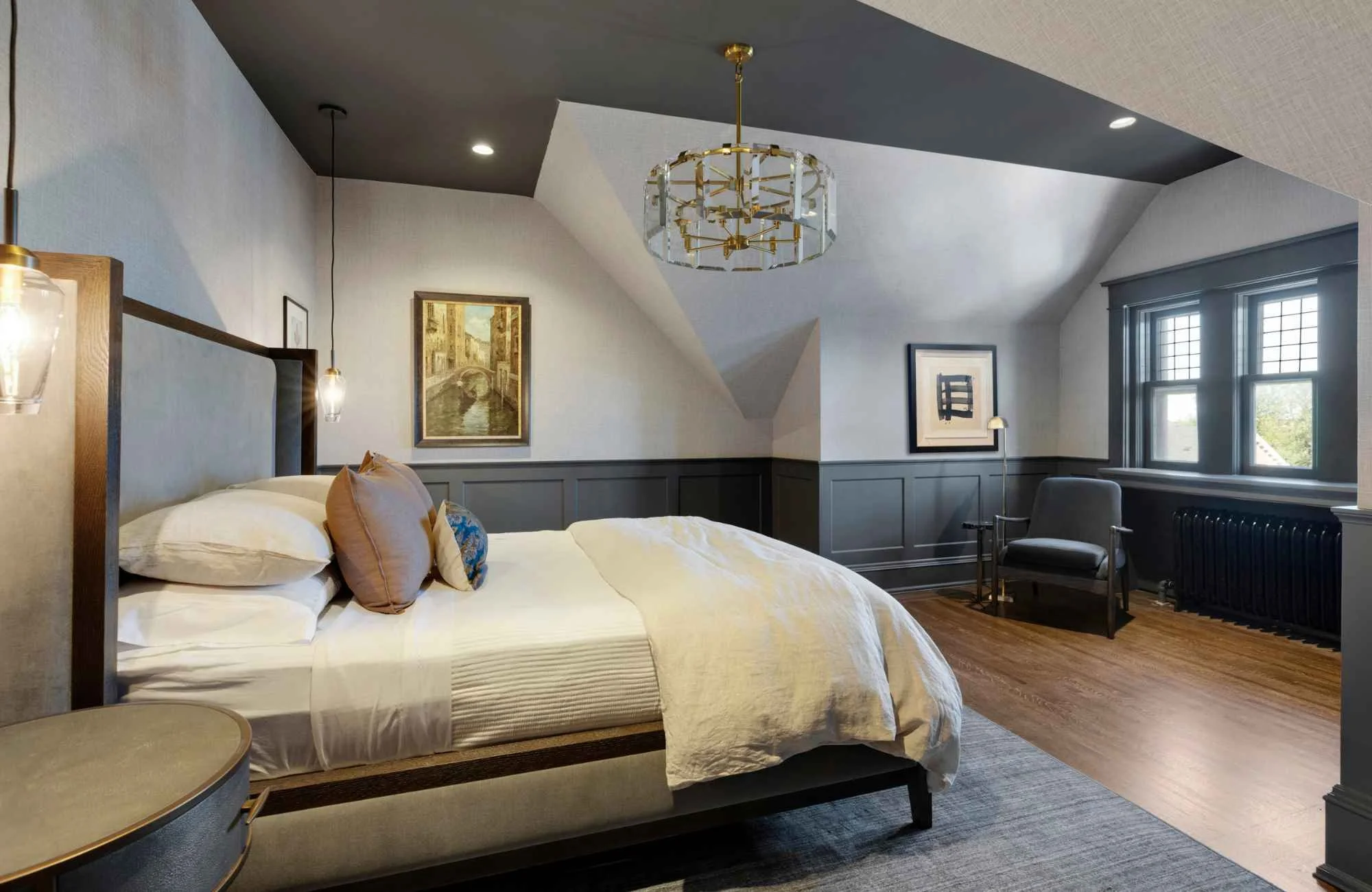
Ahhh, relaxing, cozy and just the right amount of moodiness – the exact vibe we were going for in this guest suite. Ryan and Matt had hoped that their home would be covered in shades of gray, so when they first came to the designers, we were all given 3 Sherwin Williams shades of gray to choose from: a light, medium, and dark shade. I chose the darkest shade, Forged Steel, to match the moody vibe I wanted to create. I LOVE how it turned out!
Funny enough, the couple changed direction, and the rest of the house evolved quite a bit through the design process. The home is now filled with punches of color, crazy patterns, and animal motifs. Matt and Ryan loved my original design concept, though, and wanted to stick with gray in the guest suite.
Not only was it important to create a soothing space for the couple’s guests, but I wanted the room to match the character of the rest of the house. Since the space lacked special elements, we added wainscot paneling on the lower half of the walls for interest and a custom feel, which Matt and Ryan were totally on board with.
We painted the wainscoting and ceiling in the darkest shade of gray. I’ll be honest, it felt a bit risky to paint the ceiling in such a dark color, but it really paid off – it gives such a cozy, cocooned feeling to the space. Perfect for a guest room, right? I have to give Ryan and Matt credit for pushing me a little.
The existing light fixture in the room was not original to the house, so we opted to replace it with a grand chandelier from Arhaus. Simple hanging pendant lights over the nightstands allow for easy task lighting, leaving the tabletops free for guests’ personal items.
Matt and Ryan told us that they wanted to wallpaper the sloped ceilings, another way to tie the room in with the rest of the home. The original selection had a striped pattern and just would not have worked. Instead, we landed on a grasscloth textured vinyl wallcovering that turned out to be perfect. It looks beautiful on the sloped ceilings, and effortlessly brings warmth, lightness and texture to the room. Understated sophistication for the win!
Since this is a guest room, we had to add a few thoughtful designated spaces for visitors to enjoy. I love this little reading nook by the beautifully framed windows. What a relaxing space to steal a few minutes for yourself. We selected a chair covered in fabric that seems to blend seamlessly into the gray wainscoting to maintain the spacious feeling in this nook.
And let’s not forget the coffee bar! Every guest bedroom needs a coffee station to start the day. The beautiful piece located inside the vestibule, complete with beverage fridge, was created by Ohana Home & Design. It’s the perfect amenity that I know guests will appreciate so much!
A Historic Home Ready for Modern Day Living
So, what did you think? Would you want to be an overnight guest in this room? I know I would! During the home tour in July, I constantly heard attendees describe how the room felt so relaxing, and I was thrilled! It’s exactly what we were going for: a place for guests to unwind and recharge.
Matt and Ryan love their finished home. It’s truly breathtaking. If you didn’t get a chance to take the tour in July, check out the Pillsbury Castle Instagram to see reveals of some of the other spaces. The couple is hoping to open their home again in the future for fundraising events, so I know there will be more opportunities to see inside.
Whether you have a historic home in need of a modern-day update, you’re building a brand new home, or your project falls somewhere in between, I’d love to be part of your team. Reach out to me here, and let’s begin the conversation.


