2021 Color Forecast
This year has been absolutely wild, and with all the craziness, people are looking for change - especially around the house - and there’s no better (and more inexpensive) way to do it than with a few coats of fresh new paint. Which, of course, brings me to this month’s topic: The 2021 paint color forecast roundup. Across the board, everyone from Benjamin Moore to Sherwin Williams is embracing a more comfort-led aesthetic, and the palettes they’ve released have got warm mac & cheese, baked chocolate chip cookies, and fireside cocktail hour written all over them (aka my kind of living). So, if any of that sounds right up your alley, read on. I’ve got all the details and you are going to absolutely swoon.
Xo,
Laura
AEGEAN TEAL
For the bright and happy color lovers out there, Aegean Teal from Benjamin Moore is the ideal shade. It somehow manages to balance that ultra-saturated burst of vibrancy with a simultaneous calming effect, and the result is total perfection. Its blue-green hue makes it mesh like a charm with any metal finish or color, and beyond that, it’s such a welcome and cheery sight to come home to after braving a day at work (or, if I’m being honest, even just a stressful trip to Target). If you are looking to depart from the predictability of a neutral palette, this is definitely the way to go.
URBANE BRONZE
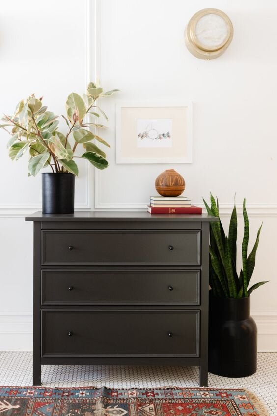
Ready to skip the small talk and make a gorgeous bold statement right from the get go? Urbane Bronze from Sherwin Williams is your new best friend. Now, before you think a black hue is a little too bold for you, this shade is much softer than an ultra-modern black thanks to its brown undertones, so it feels warm and inviting as opposed to brash and unapologetic. Ready to go all out with wall color? Awesome - it’ll make your walls feel instantly bigger. Love the color but want to take it a little slower? It will still look amazing in small doses, too, like on a dresser or bathroom vanity. Whatever your choice, this is a neutral hue you won’t want to miss.
GRANITE DUST
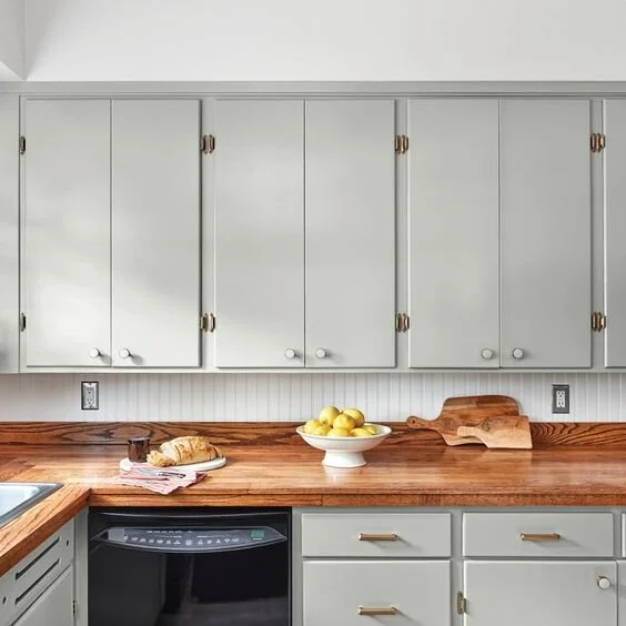
For those of us who need a little zen in our lives and are looking for a touch of predictability, Valspar’s Granite Dust is a match made in heaven. Its overarching grey qualities make it a bonafide neutral, yet it still carries a touch of a green undertone to give it an Earthy and natural feel. Paired with elements like wood, brass, and yellow, it’s a color that comes to life and gives off a tranquil energy I can’t get enough of.
CHESTERTOWN BUFF
Benjamin Moore’s Chestertown Buff is one of those shades you look at and just sigh because it’s so good. Yellow is, admittedly, hard to get right, but this shade makes it totally possible. It’s got the perfect mix of warmth and subtlety without feeling too much like a butter yellow, and yet it doesn’t quite fall into a brown or beige zone either, so it still feels charming and fresh. I especially love this one against stained woodwork or fresh white trim. The effect is absolutely beautiful and oh-so-classic.


